Styling a radio button with only CSS
Following Jesus; Husband; Father; Developer; Gamer; Tinkerer; Writing about code
As I hinted to in the previous installment of this series; a radio button is in the same situation as checkboxes on the web: no options for styling the native component, but the same strategy we used for checkboxes can be applied to radio buttons as well.
The goals
- Style the radio button
- Style the label
- Require no additional DOM nodes or configuration (including icons/images)
- Require 0 JavaScript
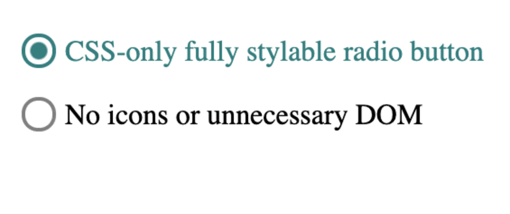
The results
The strategy
- Hide the actual radio input
- Show a styled element that looks like an empty radio button when the input is unchecked
- Show a styled element that looks like a selected radio button when the input is checked
How to get there
The CSS selectors used
Type selector
type- selects all elements of the giventype(e.g.inputwill select all<input ... />nodes)Attribute selector
[attribute="value"]- selects an element withattributewhere its value is exactlyvaluePsuedo-class
:checked- selects checkbox/radio input types oroptions in aselectthat are selected/checked/on/activePsuedo-element
::before- styleable element that doesn't actually exist in the DOM; considered the first child of the selected elementUniversal selector
*- selects anything/everythingChild combinator
>- combines two selectors; narrowing the selection on the right-hand side to only those elements that are direct descendants of elements selected by the left-hand side.Adjacent sibling combinator
+- combines two selectors; narrowing the selection on the right-hand side to only those elements that are the siblings immediately after the elements on the left-hand side
Important CSS styles used
content- used in the::beforepsuedo-element to set its contentdisplay- specificallynoneto hide elements andinline-blockto make our otherwise inline radio button able to have a consistent width and heightwidth/height- does what you think: sets width and height of the elementcolor- sets the color of the texttext-align/vertical-align- used for adjusting the position of our radio button to its labelborderstyles - How we'll form and color the radio buttonradial-gradient- used inbackgroundto fill in the radio button in the classic "half-full" style
Starting out: the HTML
Let's set up our radio button as a child of its label element with a sibling of a span of the label text:
<label>
  <input type="radio" name="key" value="value" checked />
  <span>I am a radio button</span>
</label>
<label>
  <input type="radio" name="key" value="another-value" />
  <span>I am another radio button</span>
</label>
This structure allows clicking on the label text to select the radio without needing for or unique id attributes (Note it's important the name is the same for at least 2 or more radio buttons. This creates the "radio group".). Placing the text in a span directly after the input will allow us to select it in CSS.
First step: hide the unstyleable radio
Going back to our strategy: since we can't do anything with the native radio button, we'll have to hide it and do our own thing.
label > input[type="radio"] {
  display: none;
}
We'll select the radio button (input[type="radio"]) and make sure it's labelled the way we need it to be (label >). Then just display: none to get it off our screens.
Second step: make our own radio button
Making an empty circle is easy with CSS, just put a border around a square element and give it a border radius of 50%. As with the checkbox, we'll put this on the ::before psuedo-element to avoid extra markup.
label > input[type="radio"] + *::before {
  content: "";
  display: inline-block;
  vertical-align: bottom;
  width: 1rem;
  height: 1rem;
  margin-right: 0.3rem;
  border-radius: 50%;
  border-style: solid;
  border-width: 0.1rem;
  border-color: gray;
}
Last step: make our radio change when checked
Again like the checkbox, using :checked we can style our radio button to make it appear different when selected.
label > input[type="radio"]:checked + *::before {
  background: radial-gradient(teal 0%, teal 40%, transparent 50%, transparent);
  border-color: teal;
}
label > input[type="radio"]:checked + * {
  color: teal;
}
The main difference between the radio button and the checkbox is the content and background. Here we have no difference in content and instead use a radial-gradient to fill only a portion of the circle in.
Going more in depth on the radial-gradient:
- We start with
teal 0%, sinceradial-gradientis defined from the center outward, we've basically said the center should start with teal. - Next
teal 40%means "40% of the way to the edge should be teal". Since we started with teal,radial-gradientmakes a gradient from teal to teal, also known as solid teal. - Then
transparent 50%will cause a blending from teal to transparent between the 40 and 50 percent marks. - And the final
transparentresults in solid transparency until the edge.
Putting all that together, we've essentially made a solid teal dot occupying 40% of its element (with 5% of gentle fading away on each side).
Wrapping up and side notes
Thanks for reading! I like sharing and finding things like this where common web design patterns can be done without a massive JavaScript library or framework bogging the page down. Give me some suggestions below on patterns you'd like to see me break-down in CSS/HTML-only for this series.
Follow me for the next installment in this series: accordians!
While this example had "no unnecessary DOM"; it is also perfectly valid to include an additional span (or two) to hold svg/font-awesome icons for more precise/exotic radio button designs. Then :checked should be used to alternatively display: none and display: inline-block the icons and + will need to become ~ to select all the siblings.